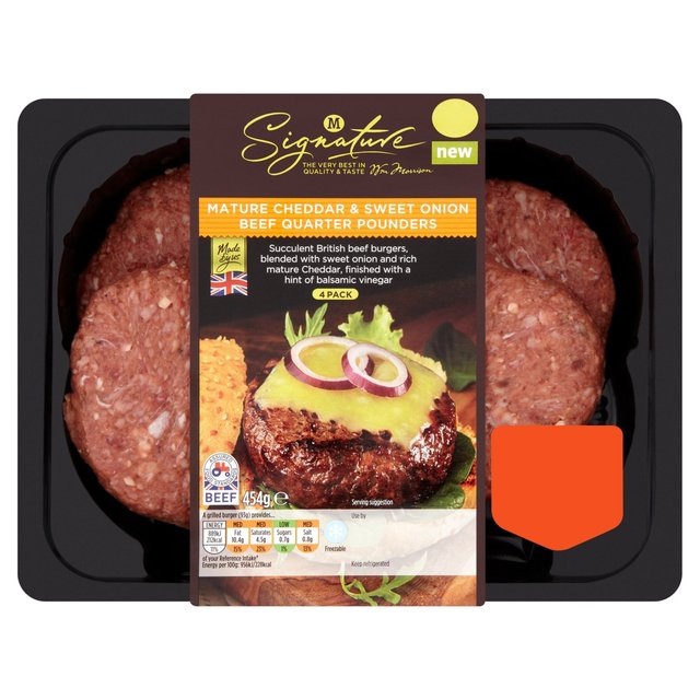
Old. 'Signature' pack
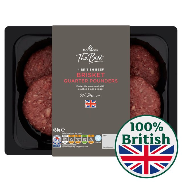
New Tree Brand 'The Best' pack
Sorry had to post links as couldn't work out how to post pics

there you go, fixed it for you. If you click the img button just above the post editor and then pop the URL inbetween the tags.sqwidge1978 wrote:Sorry had to post links as couldn't work out how to post pics
Thanks for posting that.sqwidge1978 wrote:
New Tree Brand 'The Best' pack
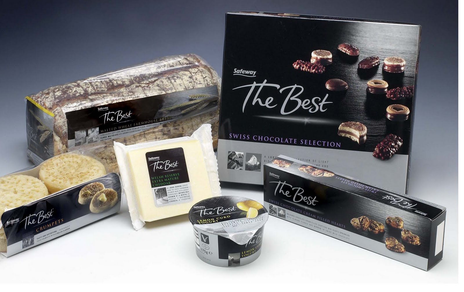
I know it's against the rose-tinted view of Safeway, but pretty much all of their branding, at the end of its life, looks ridiculously out of date now in a way that Tesco, ASDA, and Sainsbury's doesn't.