

Rainbow was an Anglia Co-op brand as opposed to East of England; the name was dropped as part of the 2008 Co-operative rebrand.
Meanwhile, instore radio is still using the Co-operative Radio jingle package: presenter links are now by-and-large Co-op Radio.
Another High Street Rebrand
-
Solent James
- Posts: 12
- Joined: Thu 07 Jan, 2016 22.22
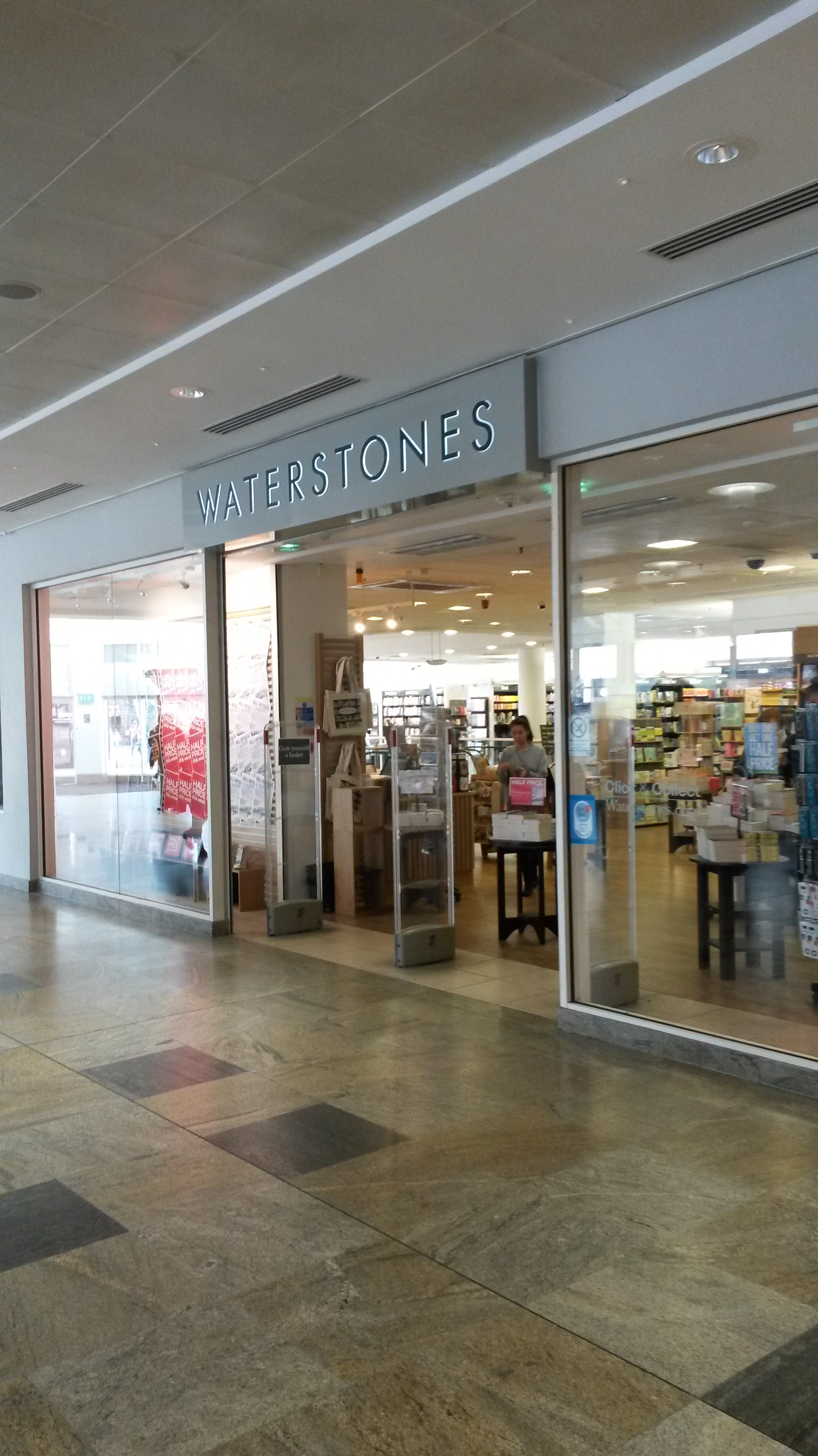
Waterstone's appear to be experimenting with a potential rebrand, their store in West Quay, Southampton has a new uppercase logo on the the outside however elsewhere in the store their lowercase logo is used...
How many co-operative societies are there still now? There can't be that many left now, at one time there used to be hundreds. When I was younger the shops & department stores around here were part of the Greater Nottingham Co-op, they merged into CWS at some time in the 90s.
Some places near here are run by the Central England Co-op, but even that''s from a merger of Midlands and Anglia in recent years, and the Sheffield Co-op merged with United, which not long after became part of the main co-operative group within the past decade too. The number of remaining co-operatives seems to be diminishing all the time.
Some places near here are run by the Central England Co-op, but even that''s from a merger of Midlands and Anglia in recent years, and the Sheffield Co-op merged with United, which not long after became part of the main co-operative group within the past decade too. The number of remaining co-operatives seems to be diminishing all the time.
22 according to Wikipedia, with The Co-Operative Group being (significantly) bigger than all the rest put together.james2001 wrote:How many co-operative societies are there still now? There can't be that many left now, at one time there used to be hundreds. When I was younger the shopes & department stores around here were part of the Greater Nottingham Co-op, they merged into CWS at some time in the 90s.
Some places near here are run by the Central England Co-op, but even that''s from a merger of Midlands and Anglia in recent years, and the Sheffield Co-op merged with United, which not long after became part of the main co-operative group within the past decade too. The number of remaining co-operatives seems to be diminishing all the time.
This WIkipedia article would have you believe there are 22 Co-operative societies left in the UK, including the Co-operative group itself. It's interesting that some of them literally only have one store, but still use the Co-operative group as a supplier.
I hope they do something sympathetic to the the fascia in Walthamstow - it's in a lovely building (check out the beehive in the masonry - and while you're at it, the inviting window display), but the signage along the block lets it down. Hopefully they'll come up with something in line with the council's draft shopfront design guideines [pdf]WillPS wrote:I can't wait to see this rather 70s funeral parlour, which I always felt looked better with the propriety branding Sheffield Co-op used, with a massive cloverleaf on its high-pitched roof.
Nothing's more inviting than open coffins! Maybe they should put some mannequin corpses in just to make it complete.thegeek wrote:I hope they do something sympathetic to the the fascia in Walthamstow - it's in a lovely building (check out the beehive in the masonry - and while you're at it, the inviting window display)
That's rather plain. It's just the name spelled out in Century Gothic?Solent James wrote:Waterstone's appear to be experimenting with a potential rebrand, their store in West Quay, Southampton has a new uppercase logo on the the outside however elsewhere in the store their lowercase logo is used...
Their new store in the MetroCentre's redesigned Platinum Mall opened with that fascia, which looks a lot better without the white holding shape seen above.
A strange period of dual-branding, if the also new flagship Tottenham Court Road store is anything to go by? The "new logo" has not been used beyond main external shop front signage (to my knowledge) and you can see why - it's nice enough in this limited context but much less distinctive if removed from it and applied to all surrounding materials. The serif "W" has a lot of equity.
A strange period of dual-branding, if the also new flagship Tottenham Court Road store is anything to go by? The "new logo" has not been used beyond main external shop front signage (to my knowledge) and you can see why - it's nice enough in this limited context but much less distinctive if removed from it and applied to all surrounding materials. The serif "W" has a lot of equity.
my missus went past on the bus after a long day at work and thought "those look comfortable"...james2001 wrote:Nothing's more inviting than open coffins! Maybe they should put some mannequin corpses in just to make it complete.thegeek wrote:I hope they do something sympathetic to the the fascia in Walthamstow - it's in a lovely building (check out the beehive in the masonry - and while you're at it, the inviting window display)