Page 5 of 75
Re: The Unofficial Sainsbury's Thread
Posted: Tue 06 Dec, 2011 23.43
by meh
On a slightly related matter, since Sainsbury's is a sponsor. Does anyone know which font the Paralympic games uses?

Re: The Unofficial Sainsbury's Thread
Posted: Tue 06 Dec, 2011 23.54
by woah
Take a look at
this - it seems a special font created especially for the Olympics branding but doesn't appear to have a name (at least not publicly)
Someone has recreated it
here on Deviantart though.
Re: The Unofficial Sainsbury's Thread
Posted: Wed 07 Dec, 2011 00.00
by meh
Thank you. The brand identity page is quite interesting.
The recreation isn't very good, although far better than I could do! I've extracted a load of the chars from embedded pdf subsets but I'm going to stay on the lookout for this font.
Re: The Unofficial Sainsbury's Thread
Posted: Wed 07 Dec, 2011 00.02
by baa
The typeface itself was made by AliasType, a small sample is on their website (which is all Flash, no fallback)
http://alias.dj/#/project/branding-79/1
I also have a recreation but it's much more faithful though I don't know where I got it from or who made it.
Re: The Unofficial Sainsbury's Thread
Posted: Wed 07 Dec, 2011 00.55
by Andrew Wood
Re: The Unofficial Sainsbury's Thread
Posted: Wed 07 Dec, 2011 01.44
by meh
Brilliant! Thank you Andrew.
Re: The Unofficial Sainsbury's Thread
Posted: Thu 08 Dec, 2011 14.40
by Col
One of the Sainsbury's Local stores in York - which I think was formerly a Jackson's - has had a redesign which I spotted this morning. The exterior painted panels have gone from white to dark grey - not a nice colour choice to complement the orange logo and doesn't fit at all with the brighter interior.
Then again, I suppose it could be temporarily dark grey before getting a top coat in a different colour. Google-imaging 'Sainsbury's Local' brings up a right palette of inconsistent shop front colours - white, burgundy (which really is hideous looking) and black. Does anyone know if this this down to the previous incarnation of the premises?
Re: The Unofficial Sainsbury's Thread
Posted: Thu 08 Dec, 2011 15.11
by adamcobb55
The overall branding is (or at least was) overseen by Lambie-Nairn. As far as I know the 'evolution' which is going on at the moment hasn't affected the branding of local stores. The current format is an orange Sainsbury's logo and white additional text (for opening times etc.) on a burgundy background.

The previous format was an orange logo for Sainsbury's and the word 'Local' in burgandy with orange additional text on a white background.
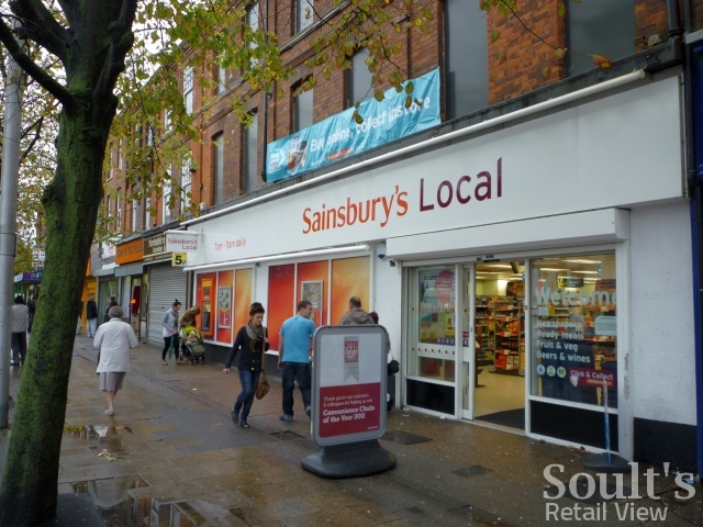
.
Grey certainly isn't part of this. The only reason I would think this might happen is if the council or planning authority has ruled against Sainsbury's using coloured back-lit signage and has instead demanded something more in keeping with the area.
Re: The Unofficial Sainsbury's Thread
Posted: Wed 04 Jan, 2012 05.28
by Cache
The Sainsbury's Local near my mother's house has just gone from white to the new burgundy/grey, with a refresh inside as well. They stock about twice as many products now but apparently they've installed what she calls 'London- style' tills - basically, they've squeezed them in so tightly that there's no space to pack. They've gone from having four tills with space for baskets and shopping bags to six tills with a small basket shelf and that's it. Seems pointless when they only ever have four members of staff in there anyway.
Re: The Unofficial Sainsbury's Thread
Posted: Sat 07 Jan, 2012 23.46
by bilky asko
I've moved recently to a street with a Sainsbury's Local on it (not with the burgundy fascia). I was interested to see, however, that it was a 24-hour Sainsbury's Local. I now have the ability to pop down at 4:00am Sunday morning for a pint of milk and a sandwich.
I'd never seen a 24-hour Local before, and I'm wondering if anyone else has?
Re: The Unofficial Sainsbury's Thread
Posted: Sun 08 Jan, 2012 02.59
by WillPS
adamcobb55 wrote:The overall branding is (or at least was) overseen by Lambie-Nairn. As far as I know the 'evolution' which is going on at the moment hasn't affected the branding of local stores. The current format is an orange Sainsbury's logo and white additional text (for opening times etc.) on a burgundy background.
The previous format was an orange logo for Sainsbury's and the word 'Local' in burgandy with orange additional text on a white background.
.
Grey certainly isn't part of this. The only reason I would think this might happen is if the council or planning authority has ruled against Sainsbury's using coloured back-lit signage and has instead demanded something more in keeping with the area.
Saatchi & Saatchi created the 1999 Sainsbury's brand (along with the tagline "making life taste better"), which came along with Greenwich blue stores and murals featuring orange things (a sliced orange, an orange corkscrew, an orange boiled sweet etc.).
Lambie-Nairn became the graphic design consultancy of choice when Justin King took position, and quickly replaced the aforementioned murals with 'sunbursts' as seen above. I don't know where their involvement started and finished apart from that (they never took credit for the tagline "try something new today" to my knowledge").
That store was indeed a Jacksons (quick way of telling - pale green interiors). These stores are particularly tired now - typically dating from around 2000 or earlier, and still feature several non-standard features - most notably the till arrangement which features a cassette based cash drawer (these have a habit of getting forgotten by the developers of the POS software - patches frequently stopped these from opening on queue).
The plum background signage has been standard since 2008. Certain locations use black or other colours instead so as to be sympathetic to the building, I rather like this one in Nottingham:
