Page 95 of 230
Re: Another High Street Rebrand
Posted: Thu 10 Oct, 2013 18.46
by cwathen
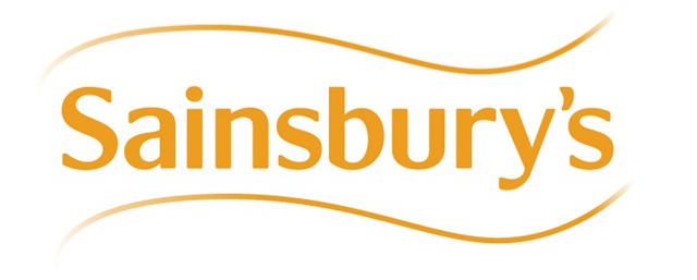
james2001 wrote:Not really a new logo then, just the old one with a wavy line underneath it- I wonder how much the branding consultants charged for that!
It's probably a marginally different shade of orange and/or has had miniscule adjustments to the kerning too which will help to justify the price - and don't forget the cost of hiring a copywriter to explain what the wavy line represents!
Re: Another High Street Rebrand
Posted: Thu 10 Oct, 2013 19.07
by martindtanderson
I don't imagine the curved line being applied to physical store signage and packaging.
Re: Another High Street Rebrand
Posted: Thu 10 Oct, 2013 22.11
by Philip
Why stop at one?

Re: Another High Street Rebrand
Posted: Thu 10 Oct, 2013 23.00
by Philip Cobbold
The logo is appearing on all the advertising signage at the moment, but not on building signage. The receipt header is yet to be updated as well, so that's still got the old stacked version of the slogan on. There's also a new custom drawn font which is being used on all advertising, which is called Mary Ann, after Mary Ann Sainsbury presumably.
Re: Another High Street Rebrand
Posted: Fri 11 Oct, 2013 14.58
by martindtanderson
Philip Cobbold wrote:The logo is appearing on all the advertising signage at the moment, but not on building signage. The receipt header is yet to be updated as well, so that's still got the old stacked version of the slogan on. There's also a new custom drawn font which is being used on all advertising, which is called Mary Ann, after Mary Ann Sainsbury presumably.
Do you know who is responsible for this refresh, and is there a page I can read more about it?
I know Twelve came in in 2011 and introduced a custom font "Sainsbuy's Slab" and have done other work since with the store.
http://twelve-studio.co.uk/work/sainsbu ... nd-refresh
Re: Another High Street Rebrand
Posted: Fri 11 Oct, 2013 17.16
by WillPS
martindtanderson wrote:Philip Cobbold wrote:The logo is appearing on all the advertising signage at the moment, but not on building signage. The receipt header is yet to be updated as well, so that's still got the old stacked version of the slogan on. There's also a new custom drawn font which is being used on all advertising, which is called Mary Ann, after Mary Ann Sainsbury presumably.
Do you know who is responsible for this refresh, and is there a page I can read more about it?
I know Twelve came in in 2011 and introduced a custom font "Sainsbuy's Slab" and have done other work since with the store.
http://twelve-studio.co.uk/work/sainsbu ... nd-refresh
The rebrand is being co-ordinated in house - not sure what involvement from design agencies there has been...
Re: Another High Street Rebrand
Posted: Fri 11 Oct, 2013 20.56
by Philip Cobbold
There's now a lovely amount of inconsistency with fonts now. Preprinted advertising is now coming in using the Mary Ann font, SELS are using the Slab font, and presumably will continue to do so, as the design has only recently been changed to the current one. Then any store produced barkers and other advertising is still using Interstate. So you can quite easily have 3 fonts in use on the one shelf. Building signage is now made in the Slab font as standard, so I'm not sure if that's going to continue after this rebrand.
One major thing is that the new Mary Ann font has been installed on all store computers now, which Slab never was, so at least the new font can be used on documents now.
Re: Another High Street Rebrand
Posted: Sun 13 Oct, 2013 17.45
by thegeek
And don't forget the shelf-edge tickets in Arial in some stores...
Re: Another High Street Rebrand
Posted: Sun 13 Oct, 2013 17.50
by WillPS
I hope that Slab is totally replaced by Mary Ann on the SELs which should resolve the mish mash issue eventually.
Re: Another High Street Rebrand
Posted: Mon 14 Oct, 2013 13.46
by JAS84
thegeek wrote:And don't forget the shelf-edge tickets in Arial in some stores...
Which as mentioned already, is due to Slab not being installed. Arial is the default.
Re: Another High Street Rebrand
Posted: Wed 30 Oct, 2013 10.50
by thegeek
Spotted this Virgin Media logo on an ad on another forum:

(It appeared at the top-left of the advert, which may explain why it's cropped like that)
A refresh on the cards?

