
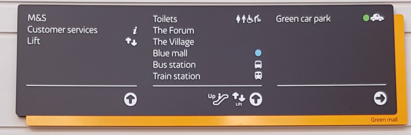
For those hitherto unfamiliar with the layout of the MetroCentre, Gateshead, one of its defining features is its colour-coded mall system (Red, Green, Blue, Yellow), as featured in the centre's original logo.
For reasons of corporate design insistency, the interior navigational signage, previously decked out in those easily identifiable signature colours (allowing you to quickly get your bearings in such a massive space) has recently been replaced with incredibly dour, universally black and orange Intu boards.
The mall name (eg "Green Mall") has been demoted to a tiny footnote in the bottom corner of the board, always in black on orange.
I've tolerated the inane tweeness of the Intu brand (particularly its grating attempt at an informal tone of voice) but this is just really terrible design putting bland corporate consistency before helpful function.
Another High Street Rebrand
Not just Intu doing this in my experience. A lot of corporations - most notably the railway - are very insistent on their corporate style, however flowery and "chic", being first and foremost the priority over any semblance of usefulness. I hope West Midlands Railway dispose of London Midland's wafer-thin white-on-black station signage sooner rather than later.
When it comes to railway signage, the old black-on-white "railway alphabet" signage just have stuck. It worked, hadn't dated, and didn't need to be changed every time a franchise changed hands. Sticking up signage in a TOC's corporate style might be a good excerise in vanity for the TOC, but it's not very practical.. or cheap when they need replacing a few years down the line (when old British Rail signage could have been up for 20, 30 years or even longer) or at least have a messy sticker covering up an old TOC's logo (as you'll find at most Northern Rail stations).
Indeed. Arriva have stuck more or less with BR alphabet, as indeed until recently had GWR. As for NR-run stations... don't get me started on the white-on-blue monstrosities.james2001 wrote: ↑Sat 10 Feb, 2018 19.06 When it comes to railway signage, the old black-on-white "railway alphabet" signage just have stuck. It worked, hadn't dated, and didn't need to be changed every time a franchise changed hands. Sticking up signage in a TOC's corporate style might be a good excerise in vanity for the TOC, but it's not very practical.. or cheap when they need replacing a few years down the line (when old British Rail signage could have been up for 20, 30 years or even longer) or at least have a messy sticker covering up an old TOC's logo (as you'll find at most Northern Rail stations).


(Oxford is a fun one now as it still has extant NSE infrastructure as well so it's a right hodge podge....
-
tillyoshea

- Posts: 365
- Joined: Sun 23 Nov, 2003 14.34
- Location: Newcastle upon Tyne
- Contact:
Jeepers creepers, you weren't kidding when you said "tiny footnote":Jonny wrote: ↑Fri 09 Feb, 2018 15.49 For those hitherto unfamiliar with the layout of the MetroCentre, Gateshead, one of its defining features is its colour-coded mall system (Red, Green, Blue, Yellow), as featured in the centre's original logo.
For reasons of corporate design insistency, the interior navigational signage, previously decked out in those easily identifiable signature colours (allowing you to quickly get your bearings in such a massive space) has recently been replaced with incredibly dour, universally black and orange Intu boards.
The mall name (eg "Green Mall") has been demoted to a tiny footnote in the bottom corner of the board, always in black on orange.
I've tolerated the inane tweeness of the Intu brand (particularly its grating attempt at an informal tone of voice) but this is just really terrible design putting bland corporate consistency before helpful function.
Yes, there are several platform zeroes dotted around, King’s Cross is another example. Normally it’s where an additional platform has been added in a larger station but it’s located nearer to platform 1. It means they don’t have to go to the expense of renumbering all the platforms or confusing passengers by adding a higher number to the wrong end of the station.
Cardiff Central has a (possibly) unique situation in that it has 7 platforms but they're numbered 0-8; 0 being the old guards/mail platform by the water tower which re-opened in about 2003 obstensibly for Ebbw Vale-bound services. The old P5 used to be a Swansea-facing bay platform in between 3 and 4 at the west end of the station which is long gone. You would think therefore it would be no bother to renumber 0 to 1, 1 to 2 etc so it all matches up. HOWEVER there are some really nice period-feature moulded clay signs in the underpass pointing to platforms 1&2, 3,4&5, and 6&7 which would be a shame to remove (I think they may even be listed under a preservation order of some kind) so instead of renumbering, Cardiff has 0, 1, 2, 3a, 3b, 4a, 4b, 6, 7 and the newest P8.gottago wrote: ↑Sun 11 Feb, 2018 18.38Yes, there are several platform zeroes dotted around, King’s Cross is another example. Normally it’s where an additional platform has been added in a larger station but it’s located nearer to platform 1. It means they don’t have to go to the expense of renumbering all the platforms or confusing passengers by adding a higher number to the wrong end of the station.


Green Mall on a yellow background too. Wonderful.
They've never been the same since they changed from Quadrant. Do the wacky themed areas still exist? Like the crafts village or whatever bollocks it was called?
"He has to be larger than bacon"
Thankfully, for whatever reason all the TOCs that have ever been in charge of stations on the Great Eastern Main Line were reluctant to deviate from Rail Alphabet too much. ONE perhaps fiddled the most, with the odd station sign written in one of their fonts, along with some directional signs. However, they only seemed to update things as necessary, with the majority of station name signs just getting a ONE logo added to the end.
When they rebranded to National Express East Anglia, it was then a sticker to cover up the old logo on these signs, replaced with the grey tube-map style lines National Express use in their branding. Then, when Greater Anglia took over another sticker went on top, white this time with no TOC branding. These stickers do seem to have peeled off on a few signs - at Ipswich the odd one or two now have the National Express branding fully exposed, with the blue ONE logo slightly visible underneath.
However, despite their many flaws, the one thing Greater Anglia has got right is the signage. A fair few stations have been refurbished in recent years, and I've noticed that all the new directional signs continue to be Rail Alphabet on a white background, using the RA symbols too. At stations that have been redone (such as Ipswich), they've also put a nice 3D British Rail logo/train station symbol up (image from our local paper):
-
tillyoshea
- Posts: 365
- Joined: Sun 23 Nov, 2003 14.34
- Location: Newcastle upon Tyne
- Contact:
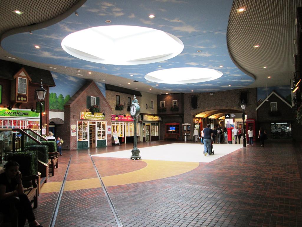
The Antiques Village still just about exists - now renamed as just "The Village", with the main feature area (with benches, wishing well etc) ripped out and replaced with non-themed standard floor tiles, which just looks odd. I initially assumed this was a temporary thing pending a remodelling of the whole area, but it's been like this for a couple of years now:
The Mediterranean Village disappeared when that part of the centre was remodelled into an extension of the 'Qube' / Yellow Quadrant.
The Roman Forum's decor disappeared many years ago, but in the last six months or so the space has been remodelled beyond recognition as some of the area has been given over to the soon-to-open 85,000 sq ft Next.