
Another High Street Rebrand
I noticed that the Simple line of skincare products have changed their logo slightly, with 'Simple' now in title case instead of all lowercase like it was previously. Though I only spotted this because old and new were side-by-side on the shelf, it's such a subtle change I'm not sure why they've bothered.

-
Martin Phillp
- Posts: 1594
- Joined: Wed 11 May, 2011 01.28
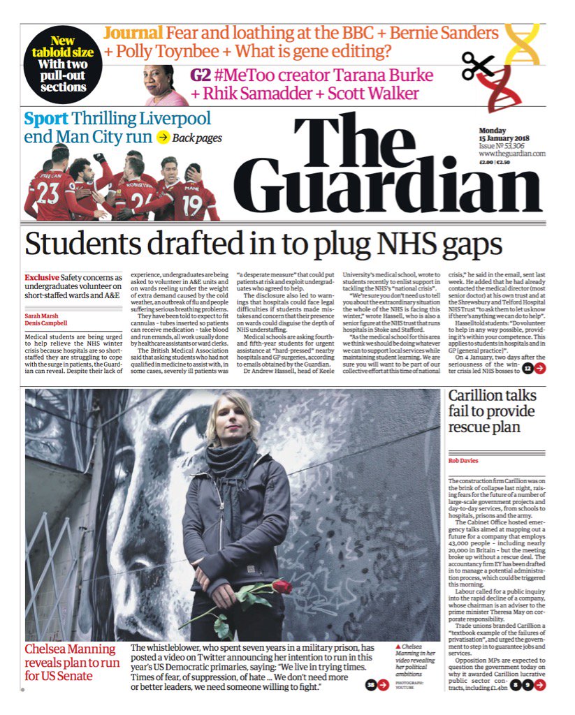
The new masthead on tomorrow's Guardian.
TVF's London Lite.
-
all new Phil
- Posts: 2039
- Joined: Sun 13 Feb, 2005 00.04
- Location: Next door to Hell
Some real nasty spacing going on there. The top half looks too cluttered and the text looks a few sizes too big. The articles below have some odd looking spaces between headline and text.
Dislike.
Dislike.
It looks really similar to The Times' front page design to me, especially the fonts, which isn't good if you're wanting to stand out from the other 'quality' paper that is printed at tabloid size.
A shame as before the move to the Berliner format The Guardian had a very distinctive and unique front page design, with its use of (gasp!) a sans serif font in Helvetica. (Okay, the italicised Garamond is probably a bit dated now, I'll give you that).

A shame as before the move to the Berliner format The Guardian had a very distinctive and unique front page design, with its use of (gasp!) a sans serif font in Helvetica. (Okay, the italicised Garamond is probably a bit dated now, I'll give you that).
-
all new Phil
- Posts: 2039
- Joined: Sun 13 Feb, 2005 00.04
- Location: Next door to Hell
“With two pull-out sections”
Does anyone actually pull them out? I always get annoyed at pull-outs within pull-outs, especially when I miss a financial pull-out completely because it’s inside a sport pull-out. JUST HAVE BLOODY SECTIONS.
Does anyone actually pull them out? I always get annoyed at pull-outs within pull-outs, especially when I miss a financial pull-out completely because it’s inside a sport pull-out. JUST HAVE BLOODY SECTIONS.
I believe they tried mocks with the Egyptian masthead and tabloid sizes in the past and couldn't get it to work.Alexia wrote: Sun 14 Jan, 2018 23.00 Also not really seeing the need for a separate masthead font. That's three fonts they're now using in general circulation. Also the black-on-white is....boring.

Well the new one doesn't work either so they'd have been no worse off. The twitter avatars are hideous.thegeek wrote: Mon 15 Jan, 2018 06.40I believe they tried mocks with the Egyptian masthead and tabloid sizes in the past and couldn't get it to work.Alexia wrote: Sun 14 Jan, 2018 23.00 Also not really seeing the need for a separate masthead font. That's three fonts they're now using in general circulation. Also the black-on-white is....boring.
"He has to be larger than bacon"

Agreed. I wonder if the black-on-white is a further cost saving exercise? Or perhaps there's a hope internally that paper sales will drop further and in 9 months they can say 'well, we tried' and do an Independent?Pete wrote: Mon 15 Jan, 2018 07.48Well the new one doesn't work either so they'd have been no worse off. The twitter avatars are hideous.thegeek wrote: Mon 15 Jan, 2018 06.40I believe they tried mocks with the Egyptian masthead and tabloid sizes in the past and couldn't get it to work.Alexia wrote: Sun 14 Jan, 2018 23.00 Also not really seeing the need for a separate masthead font. That's three fonts they're now using in general circulation. Also the black-on-white is....boring.
Either way, the website looks much worse and much less distinctive than before.
There may be a slight issue with the positioning of the masthead…
https://twitter.com/fast_philosophy/sta ... 2340209664
https://twitter.com/fast_philosophy/sta ... 2340209664
-
sqwidge1978
- Posts: 77
- Joined: Sat 25 Jun, 2016 15.42
Wouldn't the Old Masthead have had a similar issue as that was Justified on the right